JETLAG BOOKS BRANDING DESIGN
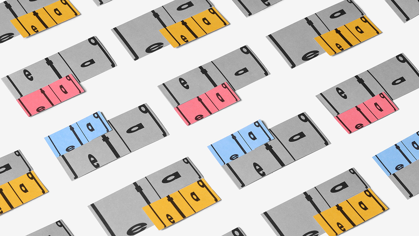
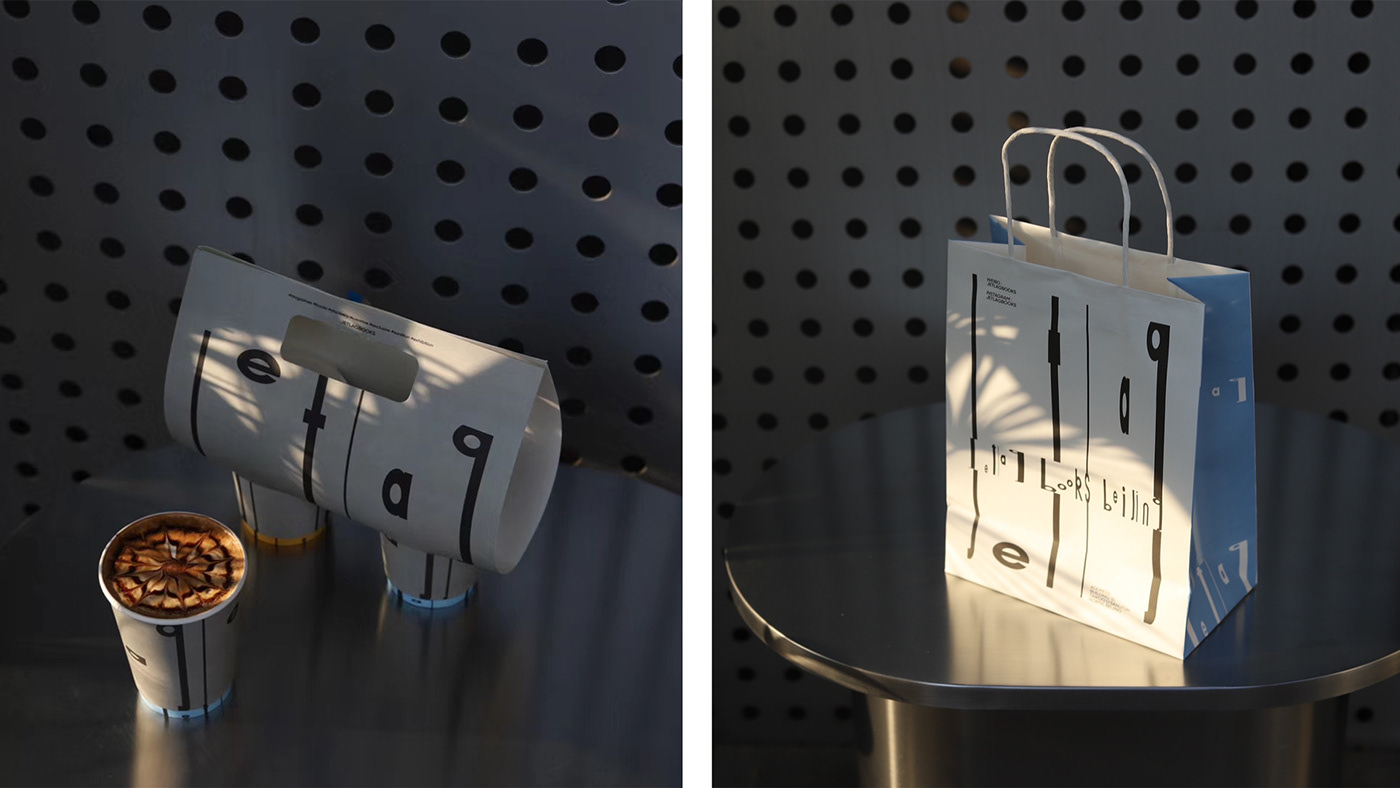
Jetlag是一个视觉上不够“整齐”的文字组合,j t l g分别向上下纵向延展出不同的负空间,我们利用这一特点将这几个字母充分的拉伸并使之整齐地划分出不同的区间,象征不同的时区,并将e a和g字母中的圆形高低错落排布成一条上升的曲线,象征不同时区中太阳的高度变化。我们将这一规则融入品牌系统中的所有标题文字中,文字的高低和宽窄都充满了时间节奏的变化,纵向拉伸的线条看起来又有了书籍的暗示。色彩方面我们选取的灰色和三种不同时间段的“天空色”来搭配,文化感之中有一丝复古的美感。不同于传统logo复制粘贴到不同物料中的用法,jetlag的条纹感和点线面之间的关系会自然形成一种图案,logo总是以贯通整个画面的方式,多元、动态地延展应用,让所有物料的品牌识别性更强但又不无聊。
-
Jetlag is a visual "neat" enough words combination, j t l g respectively to the upper and lower longitudinal extension out different negative space, we use this characteristic of the letters will be sufficient for the tensile and neatly divided into different interval, a symbol of different time zones, and the letters a and g e circular strewn at random discretion scheme into a rising curve, the height of the sun changes in different time zones. We integrated this rule into all the title text in the brand system, the height and width of the text are full of time and rhythm changes, and the vertical stretch of the line looks like a hint of the book. In terms of color, we choose the gray and three different time periods of "sky color" to match, and there is a touch of retro beauty in the sense of culture. Different from the traditional use of logo copying and pasting into different materials, the relationship between the stripe feeling and the dot, line and surface of jetlag will naturally form a pattern. The logo is always extended in a diversified and dynamic way through the whole picture, making all materials have stronger brand recognition but not boring.
©️:L3branding
creative director:guanru li
designer:zhenxing shi
creative director:guanru li
designer:zhenxing shi
photographer:zhenxing shi


